Monday, August 2, 2010
I've moved on...
I'd almost forgot that I had this blog. I've moved on to Tumblr so you can find me at jtyoung.tumblr.com
Tuesday, September 9, 2008
Thursday, September 4, 2008
Dreamy Post Processing
1. Duplicate the base layer (command-j on the Mac)
2. Set the duplicated layer blend mode to soft light
3. Apply a Gaussian blur to the duplicated layer (35 pixels in this case)
4. Duplicate the new layer and set the blend mode to screen
5. Knock down the opacity of the new layer (here it's 45%)
6. Add a Hue / Saturation layer and knock back the saturation (-15 in this case)
7. Add a Curves layer and put a bit of a S-curve to it
8. Select the background layer, go to the curves palette and command-click on the RGB channel to select the luminosity
9. Duplicate the background layer to create a luminous layer
10. Apply a Gaussian blur to the luminous layer (4 pixels here)
11. Adjust the opacity to suit
Of course, sometimes you follow a recipe and decide afterwards that you don't necessarily like the entire recipe. In this case, I decided to turn off the second duplicated layer after the fact and tweaked the curves layer a bit.
Here's the before:
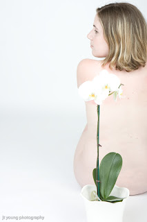
And the after:

Another technique for the books. As with all effects, your mileage may vary and really depends on the subject matter.
2. Set the duplicated layer blend mode to soft light
3. Apply a Gaussian blur to the duplicated layer (35 pixels in this case)
4. Duplicate the new layer and set the blend mode to screen
5. Knock down the opacity of the new layer (here it's 45%)
6. Add a Hue / Saturation layer and knock back the saturation (-15 in this case)
7. Add a Curves layer and put a bit of a S-curve to it
8. Select the background layer, go to the curves palette and command-click on the RGB channel to select the luminosity
9. Duplicate the background layer to create a luminous layer
10. Apply a Gaussian blur to the luminous layer (4 pixels here)
11. Adjust the opacity to suit
Of course, sometimes you follow a recipe and decide afterwards that you don't necessarily like the entire recipe. In this case, I decided to turn off the second duplicated layer after the fact and tweaked the curves layer a bit.
Here's the before:

And the after:

Another technique for the books. As with all effects, your mileage may vary and really depends on the subject matter.
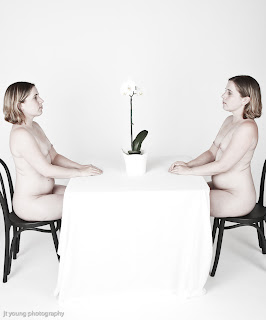
Duality
Admittedly I haven't been ranting much of late -- likely due to lack of time and energy to do so. I suppose the other reason is that simply very little has attracted my attention of late. One could possibly go on about the inaneness of Canada and the US both heading to the polls in the fall or some other world event but really this is not a place to talk politics or religion or anything remotely civic minded.
As for photography?
Well, one of the reason for the slow down of posts is simply the lack of time means that I'm also not shooting as much. I suppose if anything, I'm anxious to try more variety, more different imagery. This is post is an example of that -- more photomanipulation than normal.
Tuesday, September 2, 2008
Motion Study (Photo of the Week project #6)
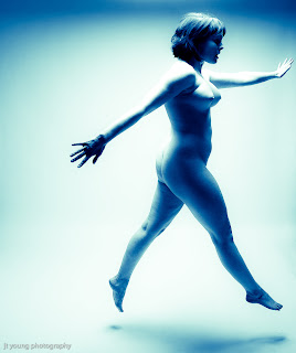
I should probably amend the title but I think I'm actually getting back to doing this once a week. After a bout of family events and general busyness I think I'm back for a bit. I'll be doing a bit of traveling in October and November (alas -- nothing photography related).
This is an experiment in motion and post-processing. Normally I don't incorporate much of either but that's the whole raison d'etre for this particular project.
Saturday, August 2, 2008
Dressing Formal (Photo of the Week project #5)
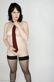
In all honestly, I should probably rename the project since I've been only able to do every other week but my intention is every week even if I'm a little uneven (blame it on summer I suppose). Simple concept -- somewhere between Vanity Fair and Vogue with a touch of the risque.
I think it's important to keep concepts simple -- adding complexity for the sake of complexity rarely enhances a photo.
Thursday, July 17, 2008
Size matters
I suppose I'm being somewhat unnecessarily provocative of the title but there's a meme going around the sex blogosphere that piqued my interest. Chelsea commented about it a few weeks back and at that time I paid it little attention but now having seen it elsewhere now, I've decidedly formed an opinion about it.

Supposedly this chart gives the definitive answer to whether size does matter to women. I won't go into a discussion of the chart or its implications other than to say that the data in the chart (and all of the supposed facts on the accompanying site) is merely opinion dressed up as fact, that (if you'll pardon the pun) the Emperor does not have any clothes. However, whatever the numbers there is a kernel of truth in that size does matter (to some people some of the time). It's the transformation of the caveat from being a statement of preference (to which Chelsea puts it rather eloquently: "I wish I didn’t have a preferred size/shape/dickly configuration. I am not part of the dick size solution; I am part of the problem. And I am sorry.") to a statement of universal truth that is disquieting. Not in the sense that it evokes a sense of inadequacy on my part (which will not be discussed here as it's not really relevant) but rather in its reduction of the truly wondrous human organ (the brain) from being a complex and individual thing to the common tiny scrap of tissue at the base of the skull we colloquially refer to as the lizard brain.
How does this relate to photography (particularly my photography)? The reality of it is that when it comes to physical parts, we all have preferences. I must shamefully admit that I too have my preferences. That though I've been exposed to enough of my preferential body part configurations so as not to be a slavering idiot when confronted by them in the flesh in the midst of a shoot, when confronted by them in a civilian context where I need not be professional I will stop and stare. I apologize here for my preference and for any unwelcome intrusions into another's privacy that it caused. But it also does play into photographic philosophies as well. I would divide the photographic world into two basic philosophies: those seeking to find the "beautiful" and capture it and those seeking the beautiful in everything. When it comes to photography, my goal is to fall into the latter category more than the former. In that sense, I hold to a tradition of photography more akin to Joyce Tenneson than to Suze Randall. Sometimes, this means that I do quash my own preferences in favor of achieving something interesting photographically that others might find appealing. Other times I do things despite others finding it not appealing simply because it should be done. I think where it matters the most is when a model asks me if her look is what I'm looking for. I'm not looking for anything specific -- I'm trying to find things worth showing the world in everyone I work with. When it comes to photography, my only preference in the body part configuration wars is the configuration between the ears -- a willingness to explore ideas and possibilities.
Subscribe to:
Posts (Atom)
